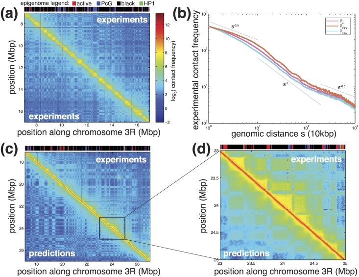
Fig 6. Comparison between experimental and predicted data.
(a) Experimental Hi-C map for a 10 Mbp region of chromosome 3R. Corresponding epigenome is shown on top. (b) Average experimental contact frequency as a function of the genomic distance s between any pair of monomers (pink), between pairs of monomers having the same (orange) or different (cyan) epigenomic state. Grey lines represent scaling laws. (c, d) Predicted (Ei = −0.1 kT) vs experimental contact maps for a 10 Mbp and a 2 Mbp region. Predicted data were multiplied by a factor 2500 to adjust scale with experiments.

