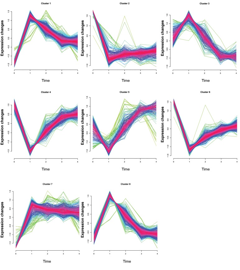
Fig.1.
Gene clustering results (time-series plots) based on gene expression levels. The horizontal axis denotes time points [0 day, day 1, 4-6 days, 1 month, and 6 months after myocardial infarction (MI)]. The vertical axis denotes the expression level (log 2 (ratio). Red indicates the variation of gene is more conformed to the center of the cluster, followed by blue, and finally green.

