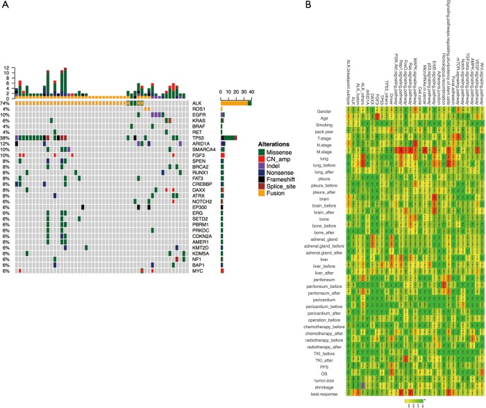
Figure 2.
Mutation spectrum. (A) Mutations detected from each patient were plotted. Different colors denote different forms of mutations. Bars on the right side of the mutation spectrum summarize the number of patients harboring certain mutations; top bars summarize the number of mutations a patient carries; (B) correlation of genomic aberrant, related signaling pathway and clinical features. Correlations were assessed using Pearson’s correlation or Fisher’s exact test for continuous variable and binary variables, respectively. Color gradient represents P values.

