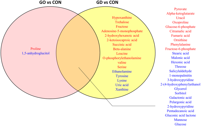
Figure 4.
Venn diagram of the metabolite list indicating the disease type-specific and -common types. Pink and yellow circles include the metabolites that are present at significantly different levels in GD with GO and GD without GO, respectively. The overlapping region includes common metabolites that pass through statistical criteria with same direction. Red indicates the metabolites with the significantly increased levels compared to the healthy control whereas blue presents the metabolite with significantly lower levels compared to the healthy control (p < 0.05).

