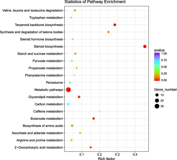
Fig. 3.
Scatter plot showing KEGG pathway enrichment among the DEGs. The vertical axis represents the pathway categories, and the horizontal axis shows the enrichment factor. The point size shows the number of DEGs among the pathway. The bigger the point size, the more genes in the pathway. The point color shows different Q values as indicated on the right. Metabolic pathways contained the most DEGs

