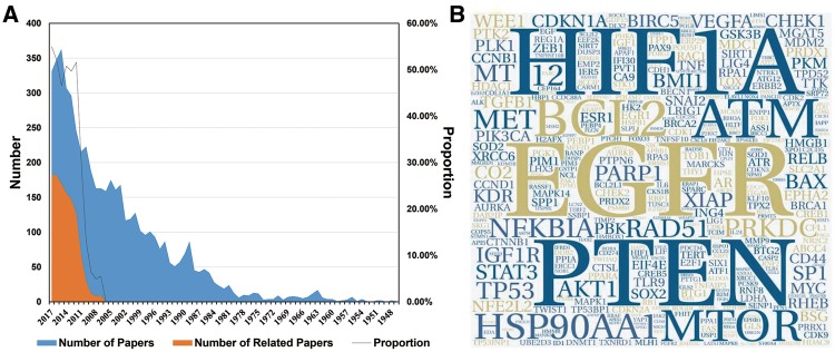
Figure 1.
An overview of the data we collected. (A) The blue colour indicates the number of papers we gathered from PubMed. The orange colour indicates the number of papers related to the research topic. The black line indicates the proportion of papers (orange/blue) from each year that were relevant to this study. (B) The hotspot genes in this study, where larger word size indicates higher frequency of the gene. This format is useful to quickly find the most prominent terms.

