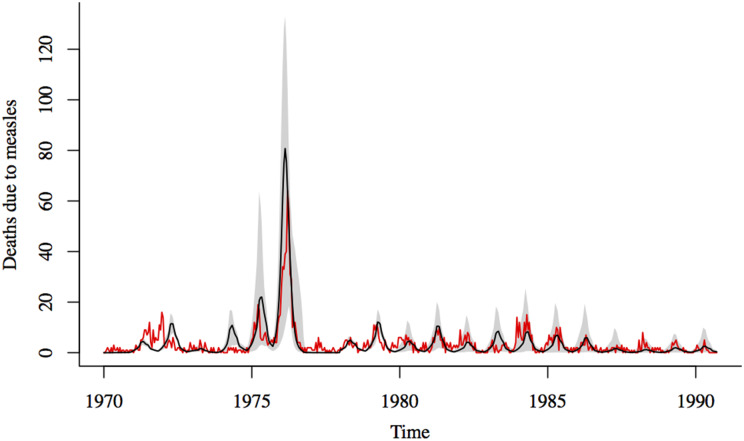
Fig. 4.
Comparison of reported and simulated measles deaths. Black line shows the median of 1000 simulations using estimates for the transmission rate and CFR for the 1976 outbreak and TSIR estimates of transmission and CFR for the rest of the time series; the shadowed region corresponds to the range between the 10th and 90th percentiles of the simulations. Red line shows the reported deaths due to measles.

