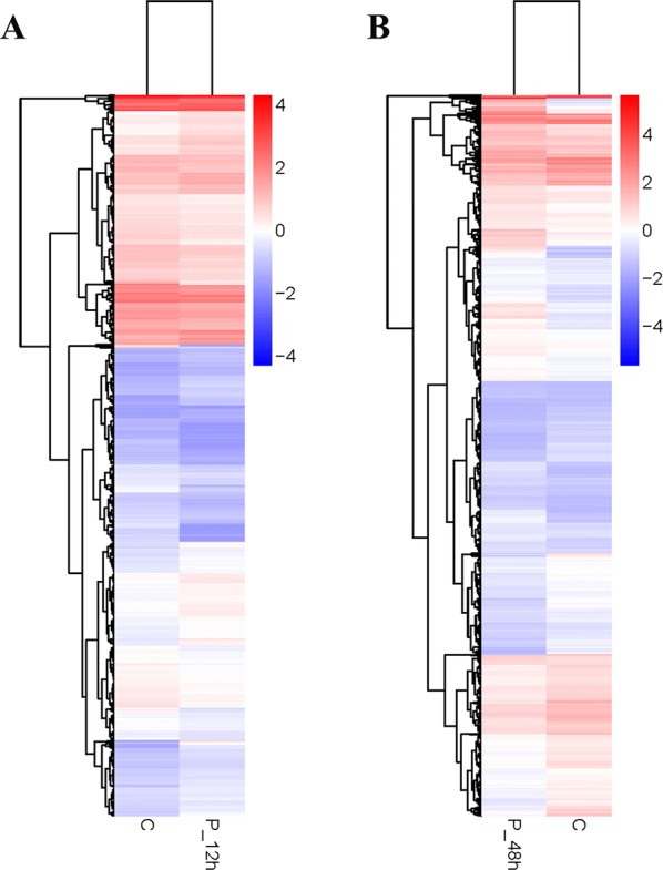
Figure 2.

Heat map analysis is used to classify gene expression patterns at 12 hpi (A) and 48 hpi (B). Genes with similar expression patterns were clustered, as shown in the heat map. Intensity of color indicates gene expression levels that were normalized according to log10 (FPKM + 1) values. Red represents high expression level genes and blue represents low expression level genes.
