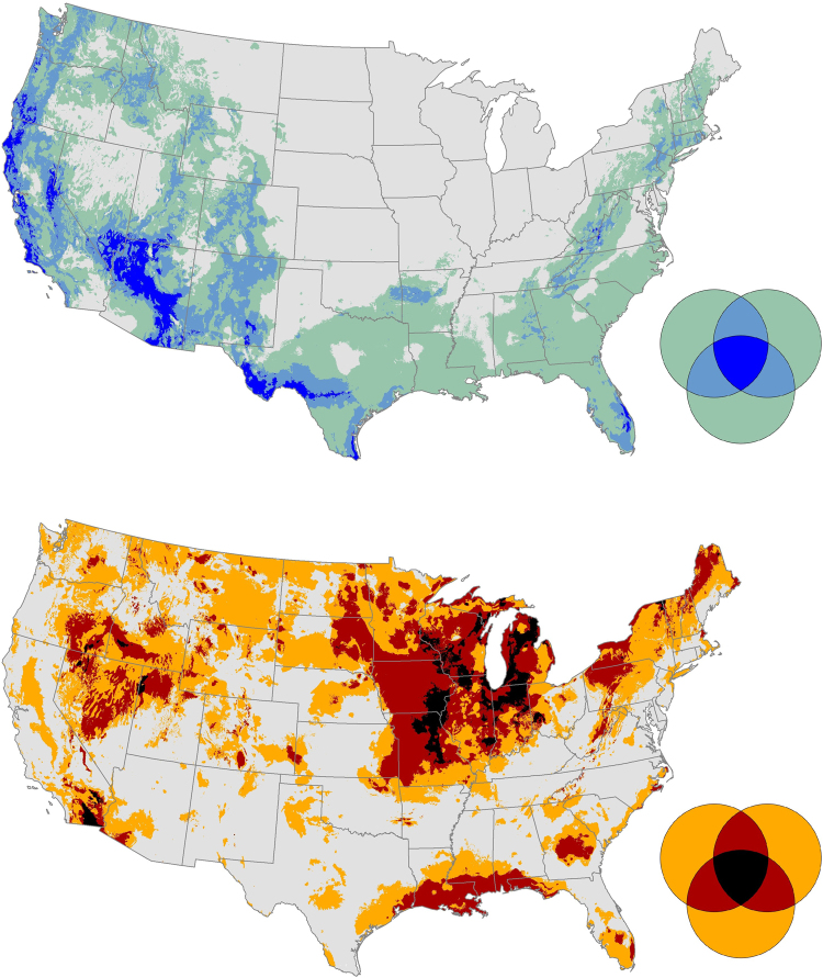
Figure 3.
Maps of inter-metric agreement (or disagreement), showing where the mode of three climate metrics (forward velocity, backward velocity, and climate dissimilarity) were in the lower (top map) or upper (bottom map) quartile. The Venn diagram legends show areas where zero, one, two, or all three metrics were assigned an area to the lower or upper quartiles. In the top map, gray indicates areas where no metrics were in the lower quartile, green indicates where only one of the metrics were assigned to the lower quartile mode, light blue areas indicates two metrics had a mode in lower quartile mode, and dark blue indicates that all three metrics were assigned to the lower quartile mode. In the bottom map, the same pattern is used to map metric agreement using orange (one metric assigned to upper quartile mode), red (two metrics), and black (all three metrics assigned to upper quartile mode).

