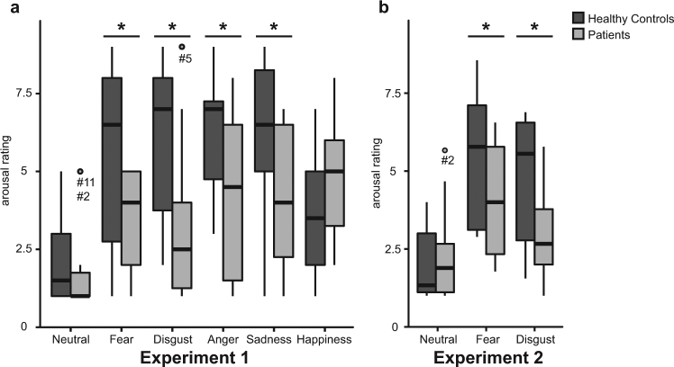
Figure 2.
Results for group comparisons of arousal ratings in experiment 1 (a) and experiment 2 (b). Boxplot diagrams show first and third quartile (bottom and top of the box), the median (second quartile indicated by the band inside the box), and the 1.5 interquartile range (IQR) between the first and third quartile (whiskers). Data points outside of the 1.5 IQR are represented by dots. Statistical analyses revealed significantly diminished arousal ratings in patients as compared to controls for videos (experiment 1) and pictures (experiment 2) aiming to induce negative emotional states.

