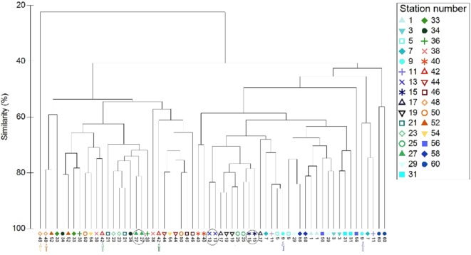
Figure 7. Cluster analysis of the paired-by-method stations’ similarity, based on square root-transformation density data and a Bray–Curtis similarity matrix.
Numbers correspond to the stations presented in Fig. 1. Paired-by-method stations with the highest similarities are indicated by a circle, while those with the lowest similarities are indicated by arrows of different color. North Aegean region stations (1–31 and 56–60) are marked in blue–green colors, while South Aegean stations (33–54) are depicted by red–orange colors).

