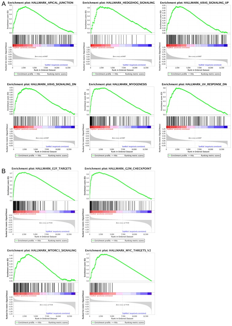
Figure 10.
Top 6 enriched pathways (P<0.01) in (A) the high-risk group, and (B) the top 4 enriched pathways (P<0.01) in the low-risk group analyzed using gene set enrichment analysis. The top curve in the graph represents the ES, which reflects the degree to which a pathway is overrepresented at the top or bottom of the ranked list of genes. The ES was calculated by walking down the ranked list of genes, increasing a running-sum statistic when a gene is in the pathway while decreasing it when it is not. The ES is the maximum deviation from zero encountered in walking the list. The score at the peak of the plot is the ES for the gene set. Gene sets with a distinct peak at the beginning or end of the ranked list are generally the most interesting. The x-axis represent all the genes in a particular gene list which were firstly scored and ranked by a statistical method based on their expression levels. ES, enrichment score.

