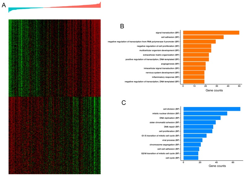
Figure 9.
Functional annotation of the DEGs in high- and low-risk samples. (A) Heatmap of the top 500 positively- and negatively-associated genes. Transition from green to red represents the increase in gene expression levels. The top panel represents the distribution of the risk values, increasing from left to right. (B) Barplots of the significantly enriched GO (BP) terms of the top 500 DEGs positively associated with risk. (C) Barplots of the significantly enriched GO (BP) terms of the top 500 DEGs negatively associated with risk. Column length: gene counts. DEG, differentially expressed genes; GO, gene ontology; BP, biological process.

