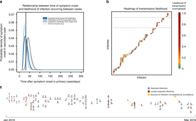
Fig. 1.
a Serial interval (SI) distribution used in the analysis. Thin blue lines represent 300 realisations of the SI distribution resulting from draws from the distributions of the parameters determining the shape of the SI and incubation period. The serial interval distribution is the distribution of the time between the onset of symptoms (fever) in a case and the onset of symptoms in the case(s) it infects. The thicker blue line represents the expected SI distribution. For comparison, the grey line represents the SI distribution estimated for symptomatic, treated P. falciparum infection from47 and the black line shows the expected SI for P. falciparum from17. b Heatmap showing likelihood of transmission occurring between infector and infectee pairs. The X axis represents all possible infectors (all reported cases) of the observed cases, organised by symptom onset date. The Y axis represents all possible infectees (all locally acquired cases, as by definition we assume imported cases were infected outside of the country). Each square represents a potential infector/infectee pair. The colours of the heatmap represent the normalised likelihood of infector j having been the infector of infectee i. where red is 1 and grey is 0. Grey squares show where cases were not likely to be infected by to any observed case, and therefore presumably infected by an individual who was not detected by surveillance. These could be asymptomatic or unreported clinical cases. c Reconstructed network, where numbers represent the ID of cases in temporal order. The strength of likelihood of connection represented by weight of edges linking cases. The two locally acquired cases identified to be infected by unobserved sources of infection are highlighted

