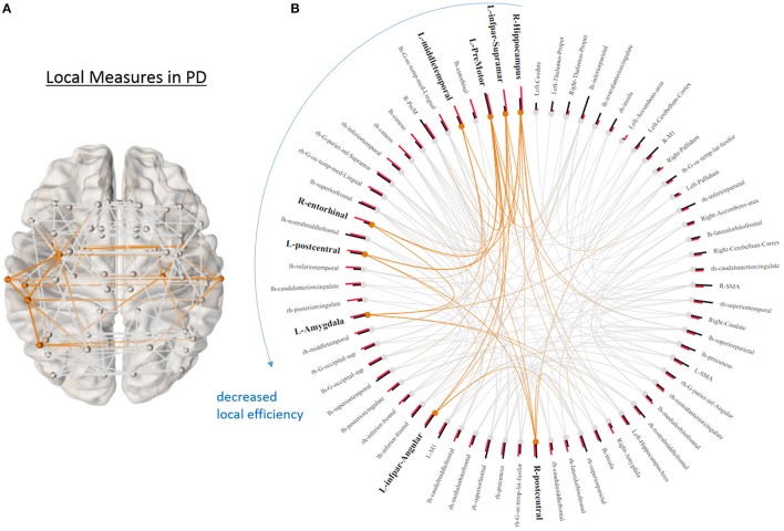
Figure 3.
Local graphical measures in PD. (A) Partial correlation connectivity patterns with the 6.32th percentiles (strongest 144 connections) are shown in PD. The orange connections indicate the connectivity within the ROIs that present higher local efficiency in PD. (B) Local efficiency (red bars) and betweenness centrality (black bars) of each node ranked by local efficiency are shown in a ring diagram. Bold font size indicates the regions that show higher local efficiency in PD (p < 0.05, uncorrected). The figure is derived from NeuroMArVL (http://immersive.erc.monash.edu.au/neuromarvl/).

