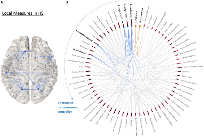
Figure 4.
Local graphical measures in HS. (A) Partial correlation connectivity patterns with the 6.32th percentiles (strongest 144 connections) are shown in HS. The orange connections indicate the connectivity within the ROIs that distinguish PD and HS with higher betweenness centrality in PD; while the blue ones represent the connections between the ROIs that differentiate two groups with decreased betweenness centrality in PD. (B) The ring diagram presents betweenness centrality (black bars) and local efficiency (red bars) of each node ranked by betweenness centrality. Bold and bigger font size indicates the regions that are significantly different between two groups (p < 0.05, uncorrected). Except the right pallidum and accumbens, all the regions with bold font show lower betweenness centrality in PD. The figure is derived from NeuroMArVL (http://immersive.erc.monash.edu.au/neuromarvl/).

