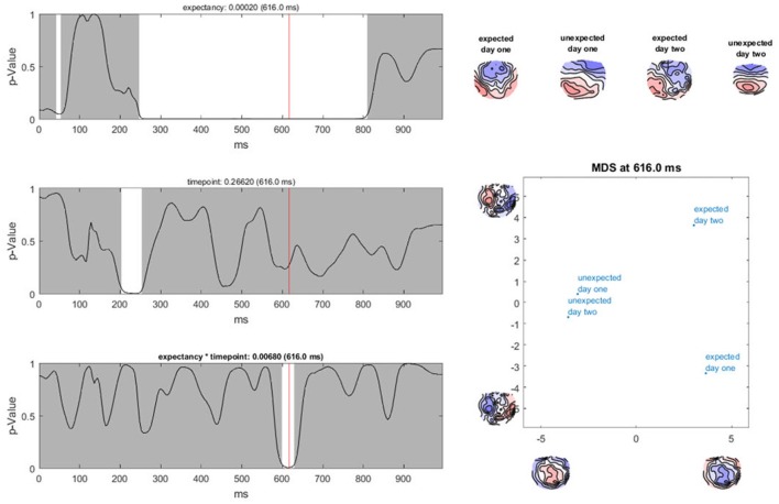
Figure 10.
TANOVA results. Left: P-values (y-axis) for the comparison between the mean ERP maps of each factor level and the interaction for every time point in ms (x-axis). The gray areas mark non-significant time points while the white areas mark periods of significant differences between ERP maps of different factor levels. Right: the four-level interaction (combination of the two main factors) is shown at a significant time point combined in a graph using a state-space representation in order to display the relationships between the factor levels. In this figure, the ERP maps of every single factor level producing an effect are displayed.

