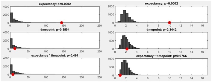
Figure 11.
Left: The y-axis shows the number of randomization runs in which a certain number of sub-threshold time points was obtained. On the x-axis, the sampling points in the data are displayed (time: 1,000 ms, sampling rate: 250 Hz, 250 sampling points). The red dot marks the count of sub-threshold time points obtained in the observed data. The dark gray bars mark the amount of randomization runs in which a certain number of sub-threshold time points were obtained with the shuffled data. Right: The distribution of the meta-analyzed results obtained using Fisher's method is shown. The gray bars indicate the results from the randomized data while the red dot marks the observed effect size.

