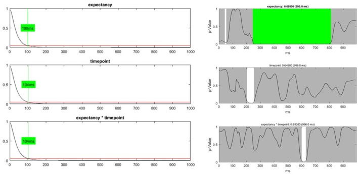
Figure 12.
Left: The global duration statistics for the different factors are shown. The y-axis indicates the p-value; the red line represents the p-threshold (5%). The x-axis represents duration in ms. The curves shown are the distribution of the length of continuous periods with sub-threshold p-values that can be expected under the null hypothesis. The green line and the indicated duration mark the length of succeeding sub-threshold time points in the randomized data which is less likely than the chosen significance level. These duration thresholds are then applied to the TANOVA plots, where periods longer than the estimated duration threshold are marked in green. The only factor for which the observed length of sub-threshold time points is significant is the “expectancy” factor (see the first row). Right: The green area on the right-hand side identifies periods in the TANOVA that meet the extracted duration thresholds (green areas).

