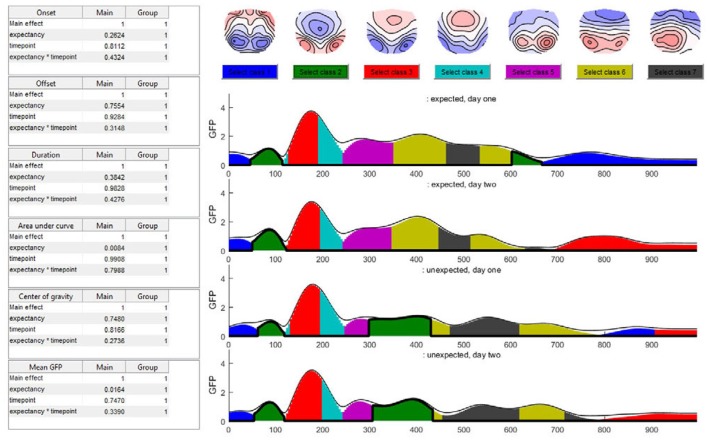
Figure 15.
The seven-class solution of the microstate assignment for the four conditions (“expected vs. unexpected x day 1 vs. day 2”). The y-axis indicates the GFP-value while the x-axis indicates time (ms). The different colors stand for specific microstate classes, and the height of the colored areas indicate the GFP explained by the corresponding microstate map. The thin black line indicates the total GFP of the data. Note how well the different microstates explain the overall variance of the data. At the top of the graph, the potential maps of the different microstate classes are shown. The table on the left side shows the results of the selected microstate class fitting statistics, separated for each factor and the interaction effect. The parameters analyzed are the onset latency, offset latency, duration, area under the curve, center of gravity, and mean GFP of each microstate class. Note that in the current analysis, the selected microstate class two appears twice in time, and thus most likely represents two functionally different states with similar maps. To disentangle this, one may limit the analysis window for the microstate statistics to include only a certain period of interest.

