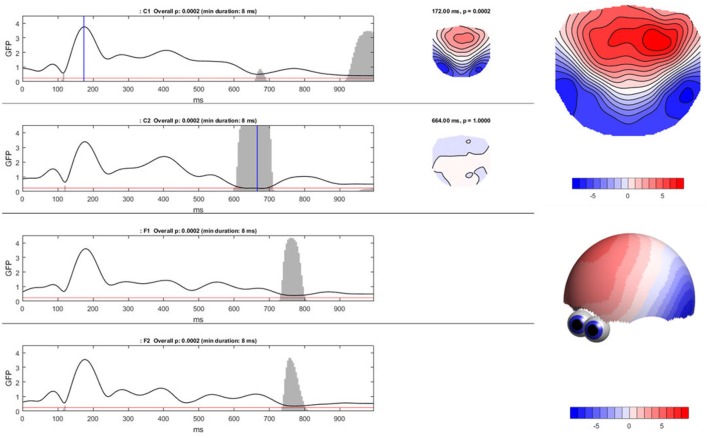
Figure 8.
Ragu output for the TCT. Left: The Global Field Power (shown as the black line) of the mean ERP maps on the y-axis for every time point in ms on the x-axis is shown separately for each condition. The red line indicates the p-threshold (0.05). The gray area marks non-significant time points. The height of the gray area indicates the p-value of the TCT (in the white area p < 0.05). Right: By clicking on the graph, the mean ERP map of a specific time point can be shown, as displayed on the right side of the GFP curves. There is a clear contrast between the moments of high GFP (in the first graph; C1) and small GFP (second graph; C2) displayed by a more intense coloring and narrower contour lines. It is possible to compute t-maps and plot three-dimensional models in this dialog window (see picture on the right).

