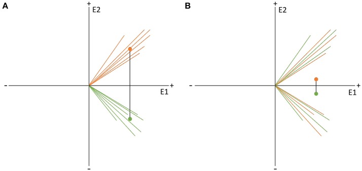
Figure 9.
Visual representation of the data randomization used to compute a TANOVA. The two colors indicate the data resulting from two different factor levels, e.g., the expected and unexpected sentence endings on the two channels, E1 and E2. The dots represent the means of the factor levels. The length of the black line between the two means indicates the strength of the difference between the factor levels which is equal to the GFP of the difference map. (A) Shows an example of very different factor levels. (B) Shows the same data after randomization between the two factor levels across subjects. Notice that the difference becomes quite small when the data is randomized. This comparison indicates that randomized data should produce difference maps with with relatively small GFP values.

