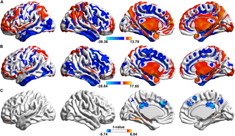
FIGURE 1.

Spatial distributions of significant ALFF in the whole frequency band (0.01–0.25 Hz). The regions showing the spatial distribution of the ALFF patterns in (A) control group, (B) aCAS group (one sample t-test, voxel size > 100, p < 0.05, FDR corrected) and (C) their between-group difference (two sample t-test, voxel size > 10, p < 0.05, FDR corrected). In one sample t-test, hotter color indicated the higher ALFF than the mean ALFF of the whole brain while cooler color meant the lower ALFF. In two sample t-test, hot color indicates the increased ALFF in the aCAS group than that in the control group, whereas cool color means the opposite.
