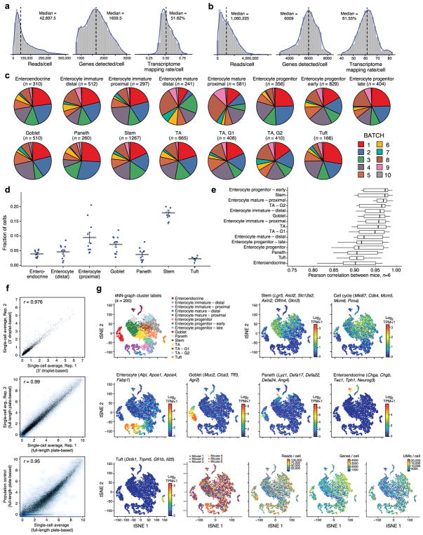
Extended Data Figure 1. Identifying intestinal epithelial cell-types in scRNA-seq data by unsupervised clustering, related to Figure 1.
a,b. Quality metrics for scRNA-seq data. Shown are distributions of the number of reads per cell (left), the number of genes detected with non-zero transcript counts per cell (center) and the fraction of reads mapping to the mm10 mouse transcriptome per cell (right) in the droplet-based 3′ scRNA-seq data (a) and the plate-based full-length scRNA-Seq data (b). c–f. Agreement across batches. (c) Contribution of batches to each cluster. Each pie chart shows the batch composition (color coded legend) of each detected cluster (post-hoc annotation and number of cells are marked on top) in the droplet-based 3′ scRNA-seq dataset. All 10 replicates contribute to all clusters, and no major batch effect is observed. (n=6 mice). (d) Cell type proportions across batches. Shown is the proportion of detected cells (y axis) in each major cell type (x axis) in the droplet-based 3′ scRNA-seq dataset in each of 10 batches (dots, n=6 mice). Grey bar: mean; error bars: standard error of the mean (SEM). (e) Agreement in expression profiles across mice. Box and whisker plot shows the Pearson correlation coefficients (x axis) in average expression profiles (average log2(TPM+1)) for cells in each cluster (y axis), across all pairs of mice. Black bar indicates median value, box edges correspond to the 25th and 75th percentiles, while whiskers indicate a further 1.5*IQR where IQR is the interquartile range. Note that clusters with additional sub-types (e.g., Tuft, enteroendocrine cells) show more variation, as expected. (f) Scatter plots comparing the average log2(TPM+1) gene expression values between two scRNA-seq experiments from the droplet-based 3′ scRNA-seq dataset (top, x and y axis), two scRNA-seq experiments from the plate-based full length scRNA-seq dataset (center, x and y axis), or between the average of a plate-based full-length scRNA-seq (x axis) and a population control (y axis, bottom). Pearson correlation is marked top left. g. Additional QC metrics and post-hoc cluster annotation by the expression of known cell type markers. tSNE visualization of 7,216 single cells, where individual points correspond to single cells. Top left corner to bottom right corner, in order: Cells are colored by their assignment to clusters (top left, identical to Fig. 1b), mean expression (log2(TPM+1), color bar) of several known marker genes for a particular cell type or state (indicated on top), the mouse from which they originate (color legend), the number of reads per cell (color bar), the number of genes detected per cell (color bar) and the number of transcripts as measured by unique molecular identifiers (UMIs) per cell.

