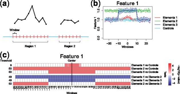
Fig. 1.

(a) FDA framework for sequence-based ‘Omics’ data: each genomic region is associated to a curve made of measurements in small, contiguous windows (a curve for each feature considered). (b) Example of pointwise boxplots, for a simulated dataset comprising curves corresponding to one high-resolution feature (Feature 1) in four different groups of genomic regions (visualized with different colors). Regions comprise up to 50 windows (windows –25 to +25), and they are aligned at their center (x-axis). (c) Summary graphical representation of IWT results on the simulated dataset in panel (b). Each row shows the adjusted P-values related to one comparison, at the selected scale threshold. Locations with significant differences between the two groups of curves are shown in red (feature over-represented in the first group) and blue (feature under-represented in the first group). Detailed IWT results and an illustration of adjusted P-value curves can be found in Supplementary Figure S1. An example using real biological data is described in Supplementary Section S3
