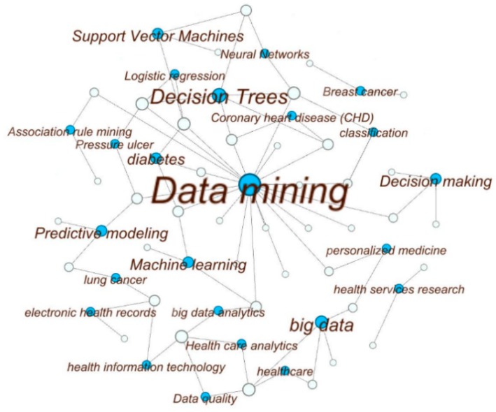
Figure 4.
Visualization of high-frequency keywords of the reviewed papers. The white circles symbolize the articles and the blue circles represent keywords. The keywords that occurred only once are eliminated as well as the corresponding articles. The size of the blue circles and the texts represent how often that keyword is found. The size of the white circles is proportional to the number of keywords used in that article. The links represents the connections between the keywords and the articles. For example, if a blue circle has three links (e.g., Decision-Making) that means that keyword was used in three articles. The diagram is created with the open source software Gephi [34].

