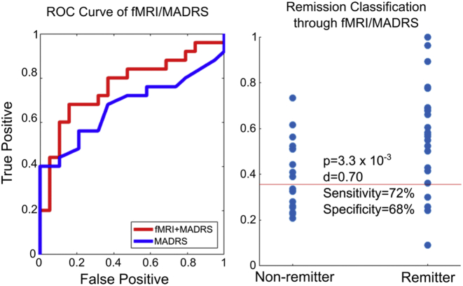
Fig. 3.
Left) The ROC curve of remission-prediction accuracy using functional imaging data before treatment, functional imaging 24 h after the first treatment dose, and the baseline MADRS score. Here true positive denotes the percentage of remitting subjects that were correctly predicted as such, while false positive indicates the percentage of non-remitters incorrectly classified as remitters. The ROC curve of MADRS alone is shown for comparison. Right). The predicted remission probabilities used to generate the ROC curve on the left. “p” is calculated as a two-sample t-test while “d” is the Cohen's effect size. The red line represents the cutoff probability that gives the sensitivity and specificity values shown.

