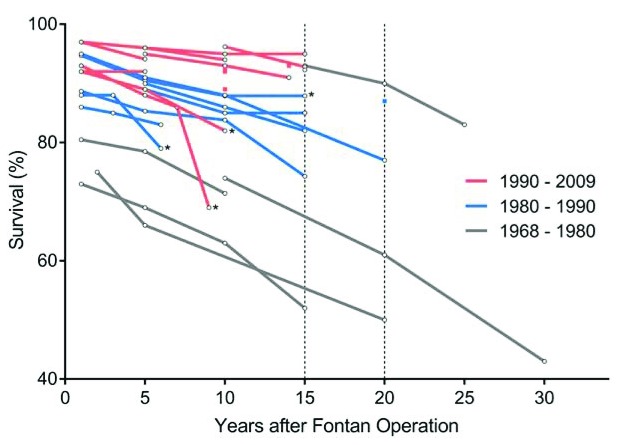
Figure 3. Survival following Fontan completion.
Each line represents a study assessing survival at multiple time points and is colored by surgical era. Dots represent Kaplan-Meier survival estimates. Studies marked with an asterisk show survival curves for death, transplant, or Fontan revision; others show survival curves for only death. This figure has been reproduced with permission from Kverneland et al. and John Wiley and Sons 21.

