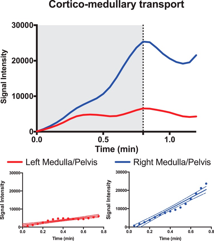
Figure 3.
Region of interest (ROI) analysis signal as a function of time, showing a representative I/R (red) and contralateral (blue) medullary/pelvic signal curve. The gray area illustrates the timing to the maximum peak of the medullary signal. The bottom image shows the linear relationship between the signal intensity and the inflow over time in the medullary ROI.

