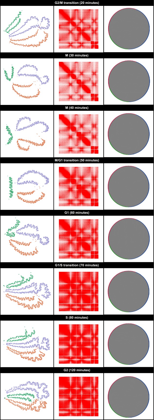
Fig. 3.

GrapHi-C visualizations for fission yeast contact maps at various stages of the cell cycle. Cell cycle labels and the corresponding time points are given on the top of each panel. GrapH-C images are presented in column 1. In these images, vertices were coloured according to their corresponding chromosome (chromosome 1: purple, chromosome 2: orange, chromosome 3: green) and edges were hidden. Graphs were visualized in Gephi using the ForceAtlas2 layout. The corresponding heatmaps generated by Java Treeview are in column 2. In these heatmaps, the opacity of a cell is directly related to the frequency of the interaction. Column 3 contains the Circos plots that correspond to the contact maps. Circos plots were visualized in Cytoscape. Vertices were coloured according to their corresponding chromosome (chromosome 1: blue, chromosome 2: red, chromosome 3: green) and grey lines represent an interaction between two vertices. Note that the area inside the circle appears to be solid grey due to the number (and subsequent density) of interactions in these datasets
