Fig. 4.
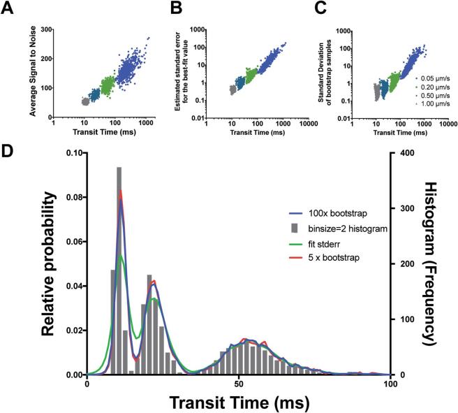
Density kernel estimation enables visualization of transit time distributions across scales. A-C) Scatter plots comparing transit time measurements from 640 simulations (30 s duration, 120 mol.) with diffusion coefficients of 1.0 μm2/s (grey), 0.5 μm2/s (turquoise), 0.2 μm2/s (green) and 0.05 μm2/s (blue) with different error metrics, signal-to-noise (A), correlation fit standard deviation (B) and standard deviation of 100x bootstrap samples (C). D) Density kernel estimation of the data of A (shown here as histogram, with binsize = 2) with different error metrics compared to Histogram visualization method with widths corresponding to 100x bootstrap (blue-line), 5x bootstrap (red-line), correlation fit standard deviation (green-line). (For interpretation of the references to color in this figure legend, the reader is referred to the web version of this article.)

