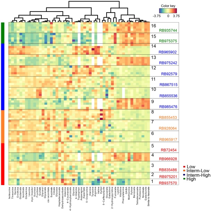
FIGURE 4.
Heat map of metabolites in culms selected by the PLS-DA VIP score. Each row represents a metabolite identified in at least three biological replicates (the number of squares represent the exact number of replicates), whereas columns represent the metabolic abundance among genotypes. Changes in the abundance of metabolites from the overall mean concentration for each genotype are shown in blue (low correlation) or red (high correlation).

