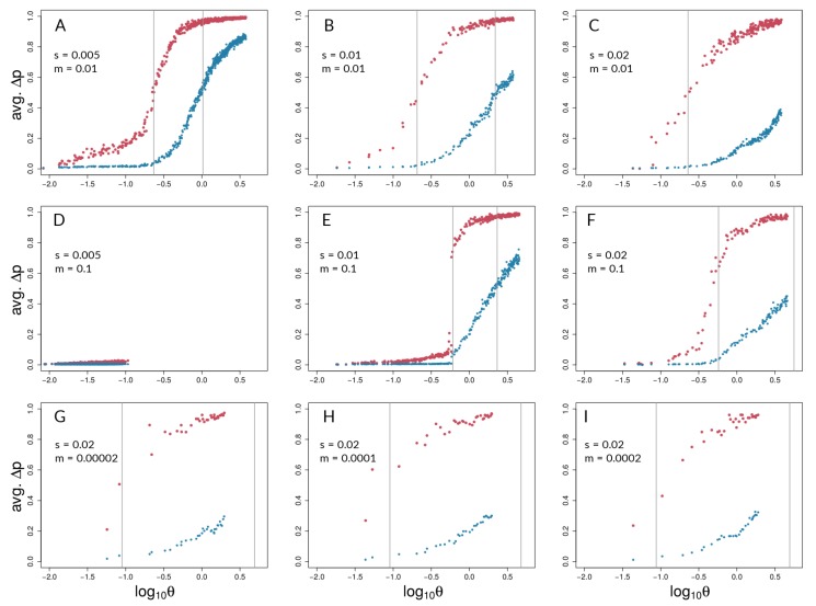
Figure 4.
Barton’s coupling coefficient () and average AFD between demes, for different combinations of s and m (values given in each panel). Each plot (A – I) shows data points for selected (red) and neutral (blue) sites from 50 independent simulation runs with equal parameters. Grey lines indicate the point of highest slope (i.e., inflection point) by nonlinear least squares model fitting across the 50 respective runs for selected and neutral sites (Table S2). It should be noted that grey lines could fall outside the range of respective data points if the predicted inflection point was not reached.

