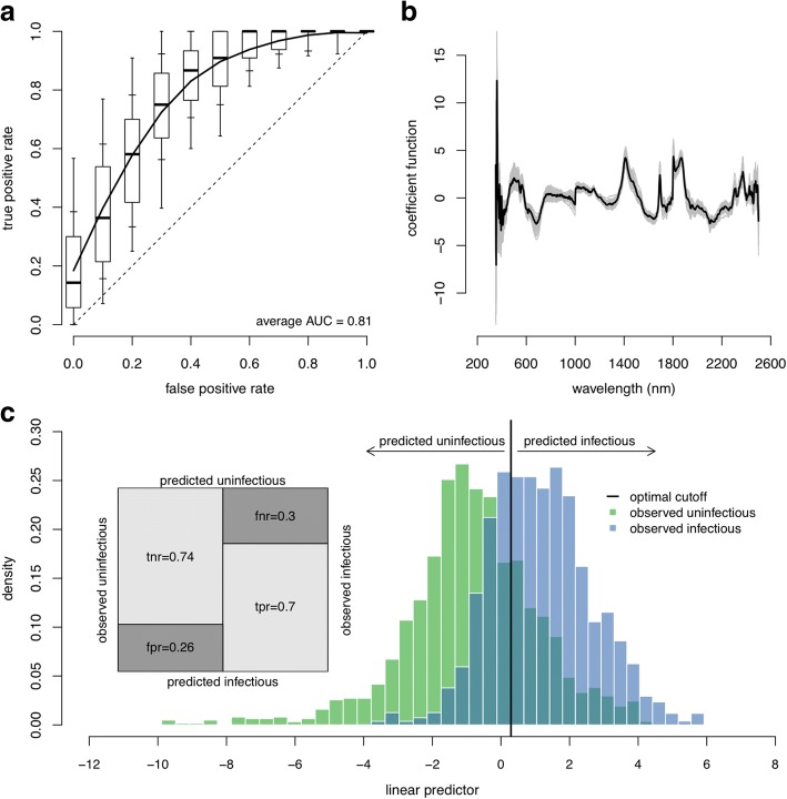
Fig. 2.
The ability of NIRS to determine sporozoite prevalence. Results are for a binomial GLM with 8 PLS components. a The receiver operating characteristic (ROC) curve for the best-fit model showing the false positive and true positive rates achievable for different classification probability thresholds whilst the overall performance is given by the area under the ROC curve (AUC). The dashed line denotes a model with no predictive ability (a random chance of correctly predicting sporozoite presence) whilst a perfect model with 100% sensitivity and specificity would be in the top left corner (coordinates 0, 1). The solid line shows the average ROC curve whilst the boxplots show the variability for 100 randomisations of the training, validation and testing datasets (with box edges, inner and outer whiskers showing 25th/75th, 15th/85th and 5th/95th percentiles, respectively; and the black line inside the box showing the median/50th-percentile). b The best fit coefficient functions for each of the 100 dataset randomisations (grey lines) and the corresponding average (black line). c The histogram of the estimated linear predictor for the test observations, colour-coded by the true class, shows the model’s ability to separate the two infection groups. The vertical black line indicates the optimum threshold for classifying mosquitoes as infectious or not. The shaded area where the two distributions overlap corresponds to misclassified test observations - false negatives to the left and false positives to the right of the optimal classification threshold. The confusion matrix (inset) shows the different error rates: tnr, true negative rate; fnr, false negative rate (specificity); fpr, false positive rate; and tpr, true positive rate (sensitivity)

