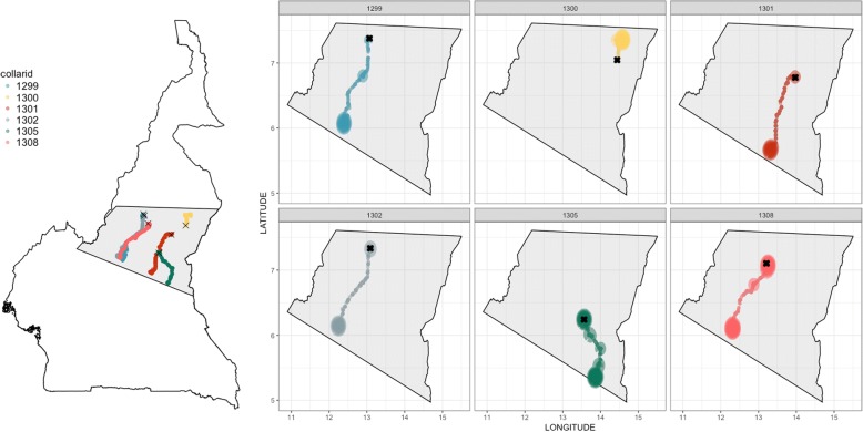
Fig. 5.
Hot spot analysis of the locations visited during the transhumance period between October 2014 and May 2015 in Central Cameroon. On the left side of the figure the trajectories of each GPS collar are displayed with a different colour on the section of the Cameroonian map. On the right side two-dimensional density plots of the recorded GPS locations. The trajectories are displayed by the dots of different colour representing the GPS locations recorded per each collar. The intensity of the colour reflects the occurrence (count) of GPS recordings (counts of observations) at each specific area (e.g.: most of the GPS locations of collars number 1301 and 1302 were recorded in two locations while, on the contrary, the GPS locations of collar 1305 were mainly recorded in 5 areas). In both sides of the figure the black X indicates the starting point of the transhumance

