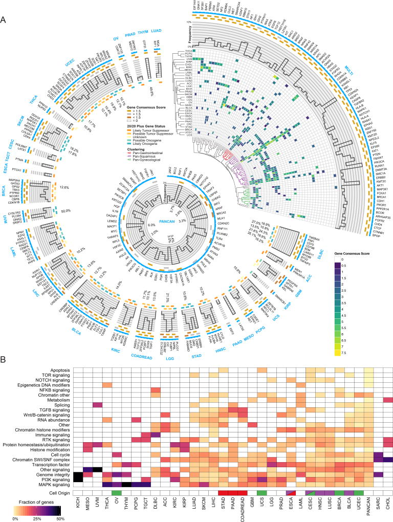
Figure 2. Cancer driver gene discovery workflow.
(A) Circos(Krzywinski et al., 2009) plot displays 299 cancer genes. Each sector indicates a unique cancer type (text in blue) with predicted drivers unique to that cancer type listed (gene name in black). Only tissues having at least one unique driver gene are shown. The top right sector shows all genes found significant in multiple cancer types. Next, a categorical score of gold, silver, or bronze is assigned to each gene based on the highest consensus score. If a gene was not scored and required rescue, then the field is empty. The next ring illustrates the mutation frequency of a gene. For the top right wedge the PanCancer frequency is used, while cancer-type-specific frequencies are used in the remaining sectors. Where frequencies exceed the y-axis limit of 10%, the innermost label indicates the frequency. The final ring uses a 5-point scale from orange to teal for representing each gene from likely tumor suppressor to likely oncogene, respectively, according to the 20/20+ algorithm. Finally, in the top right slice, we show hierarchical clustering of the gene consensus scores for genes that were found in more than one cancer type (note: CRC refers to the COADREAD cancer type). Additionally, significant gene clusters (permutation test) identified Pan-Gastrointestinal (red), Pan-Squamous (purple), and Pan-Gynecological tissues (green). The middle ring illustrates all genes that were found only using PanCancer results, or were otherwise rescued. (B) Heatmap showing clustering of different cancer types by pathway / biological process affected by associated consensus driver genes. Cell of origin for pan-gynecological, pan-gastrointestinal, and pan-squamous are colored as above. See also Figures S2, S3 and S4, and Tables S1, S2, and S7.

