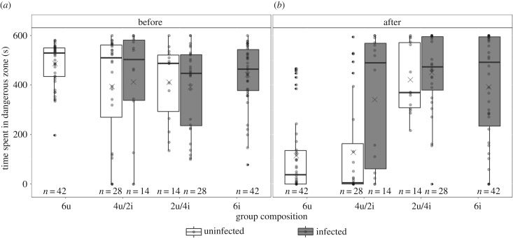
Figure 3.
Time spent in the ‘dangerous’ zone (a) before and (b) after a simulated bird attack. Results are shown per treatment group: 6u, 4u/2i, 2u/4i and 6i; and for uninfected (white) and S. solidus-infected (grey) individuals. The edges of the boxplots indicate the first and third quartiles, the solid lines the median, the crosses the mean, the whiskers the highest and lowest values within 1.5-fold of the inter-quartile range and the dots, the outliers.

