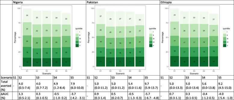
Fig. 3.
Distribution of pneumonia cases by wealth quintile and scenario in Nigeria, Pakistan, and Ethiopia. The numbers in the green boxes represent the percentage of cases in each wealth quintile. Wealth quintiles: I = Lowest, II = Lower, III = Middle, IV = Higher, V = Highest. AUC = area under the curve. ∆ AUC: Percent change in AUC compared to Scenario 1 (S1). 95% uncertainty ranges are indicated in parentheses. (S1): no vaccine program available; S2: current vaccine program; S3: total number of vaccines from S2 distributed equally across quintiles; S4: vaccine coverage proportional to quintile-specific baseline morbidity risks; S5: equal baseline morbidity risk with current quintile-specific vaccine coverage

