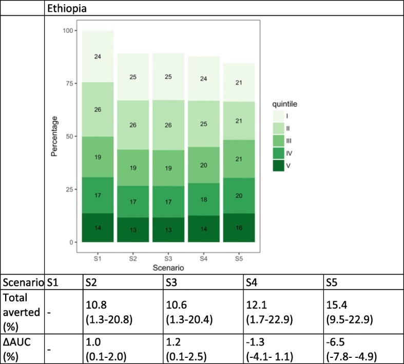
Fig. 4.

Distribution of diarrhea cases by wealth quintile and scenario in Ethiopia. The numbers in the green boxes represent the percentage of cases in each wealth quintile. Wealth quintiles: I = Lowest, II = Lower, III = Middle, IV = Higher, V = Highest. AUC = area under the curve. ∆ AUC: Percent change in AUC compared to Scenario 1 (S1). 95% uncertainty ranges are indicated in parentheses. (S1): no vaccine program available; S2: current vaccine program; S3: total number of vaccines from S2 distributed equally across quintiles; S4: vaccine coverage proportional to quintile-specific baseline morbidity risks; S5: equal baseline morbidity risk with current quintile-specific vaccine coverage
