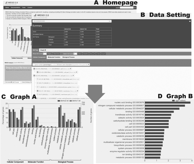
Figure 1.
The WEGO interface. This combination chart is just a demonstration of the use of WEGO. Panel (A) is the homepage, uploading the input file. Panel (B) shows the settings of the data. Panels (C) and (D) are two different output plots. (A) Homepage with an example of submission; (B) Data Setting—GO tree tab, showing the statistical summary and GO term selections; (C) Graph A: traditional WEGO histogram: comparisons in gene numbers and percentages of selected GO terms. More datasets uploaded, there will be more column serials in the histogram. (D) Graph B: log (10) of P-values obtained from all datasets of selected GO terms in descending order, indicating the data differences, especially significant differences.

