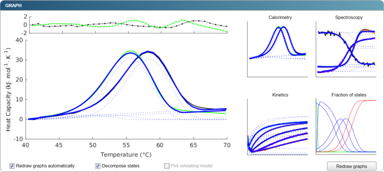
Figure 2.
An example of the graphical output. Initial datasets with modelled signal in blue are depicted as icons on the right-hand side and can be zoomed-in and displayed on the left-hand side. The zoomed-in version also depicts the residuals at the top so that a user can estimate the quality of the fit and the presence of any systematic errors or unexplained data variation. In the presented case, waves are apparent in the residual plot that are indicative of an approximately 5% misfit at high temperatures. When the option ‘Decompose states’ is selected, the contribution of each step to the overall signal is plotted in dotted lines. Apart from the plots of data and corresponding modelled signals, modelled fractions of states are presented in one of the graphs.

