
Fig. 4. Frequency distributions of individual landfill CH4 emissions for different geographic regions for the year 2012 and three 2030 scenarios.
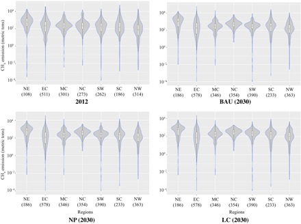
The BAU, NP, and LC represent three scenarios in 2030. The violin plots show the distributions of landfill emissions, with each side representing the same value. The box plot inside the distribution indicates the first, second (the median), and third quartiles of the distribution. The number of landfills in each region for each time period are parenthetically represented.