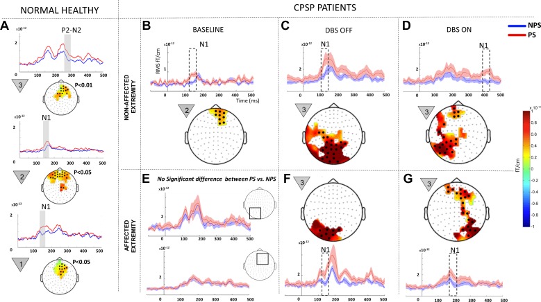
Fig. 3.
Within-state comparisons in all patients: painful (PS) vs. nonpainful stimulus (NPS) comparison within each state (baseline, OFF, and ON) for all patients (n = 7). A: data from normal healthy controls (n = 10, 7 men and 3 women; age 45 ± 15 yr) previously studied by our group using the same paradigm (Gopalakrishnan et al. 2016b). Baseline data (B and E) were modified from our earlier publication on the same patient population (Gopalakrishnan et al. 2016a). Because no significant difference was recorded between PS and NPS at baseline in the affected extremity (E), the mean event-related field (ERF) signal from 2 representative regions that displayed predominant effect in the OFF and ON states (shown in squares) are shown. The signal shows elevated ERF components during NPS (blue line) on the same scale compared with DBS OFF (F) and ON (G). Each panel shows a difference topography (PS − NPS) masked to show the sensors with significant effect (highlighted with black dots) and a line plot with the mean evoked responses from sensor cluster on the topography for each condition. Shading around the line plots show SE, whereas the dotted box highlights the temporal location of the significant effect. The countdown cue that evoked the significant effect is shown to the left of each topographic map. To better visualize slow changes during significant effect, the line plots were smoothed using a 10-ms moving average filter.

