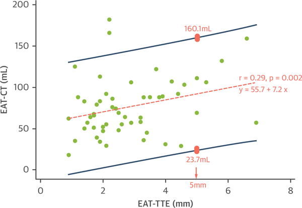
FIGURE 1.

Scatter Plot Between EAT-CT and EAT-TTE
The orange dashed line represents the regression line of best fit. R value is the correlation coefficient, and the regression equation is the epicardial adipose tissue area/volume measured by using cardiac computed tomography (EAT-CT) as the outcome variable (y) and epicardial adipose tissue linear thickness according to transthoracic echocardiography (EAT-TTE) as the independent variable (x). The dark blue lines represent 95% prediction intervals. An example is illustrated by the pink boxes: when EAT-TTE is 5 mm, the predicted EAT-CT is between 23.7 and 160.1 ml, representing wide variability and suggesting poor precision.
