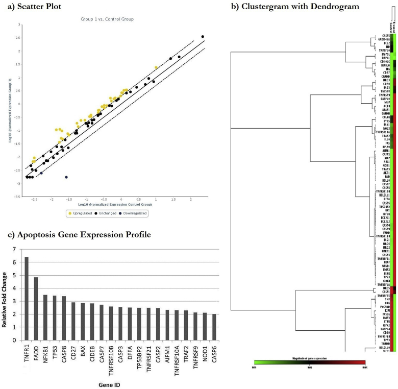
Fig. 5.
Scatter plot compares normalized expression of each gene on array between the two selected groups by plotting them against one another to visualize large gene expression changes (a). The central line indicates unchanged gene expression. The dotted lines indicate selected fold regulation threshold. Data points beyond the dotted lines in upper left and lower right sections represents differentially expressed genes. The clustergram performs non-supervised hierarchical clustering of the entire dataset to display a heat map with dendrogram indicating co-regulated genes across groups or individual samples (TNFRSF1A = TNFR1) (b). Expression of key genes involved in apoptotic signalling pathway analysed through RT2 PCR array profiler (c).

