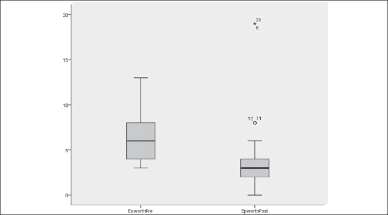
Fig. 3.

Epworth score distribution at baseline and after six months after turbinate decongestion. The box plots show the median and inter-quartile range and the error bars show the 5th and 95th percentiles.

Epworth score distribution at baseline and after six months after turbinate decongestion. The box plots show the median and inter-quartile range and the error bars show the 5th and 95th percentiles.