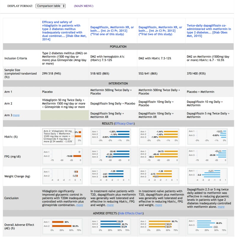
Figure 3.

Comparison table display with four trials on various treatments for diabetes mellitus. This display contains key elements of selected studies in a tabular format according to the Population, Intervention, Comparison, Outcomes (PICO) framework [29-32]. Studies are displayed in columns, and attributes of studies are displayed in rows. Study results for primary outcomes and adverse events are represented in bar graphs [46]. Hovering over a bar brings up a callout with details on the intervention of the selected study arm. The scale of each measure is normalized across all studies to enable direct visual comparison. An illustration of the comparison table display for randomized controlled trials on rheumatoid arthritis is available in Multimedia Appendix 1, Figure A2.
