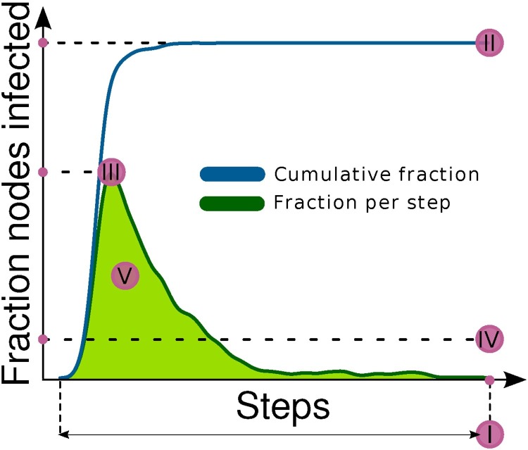
Fig. 3.
Measures of outbreak magnitude. The green line corresponds to the fraction of nodes infected at each step of a single simulation, while the blue line corresponds to the cumulative fraction of infected nodes. For each simulation we recorded the duration (I), the cumulative fraction of nodes reached by the infection (II), the maximum and the average fraction of infected nodes per step (III, IV), and the area under the curve that depicts the fraction of infected nodes per step (the green line) (V). (For interpretation of the references to color in text/this figure legend, the reader is referred to the web version of the article.)

