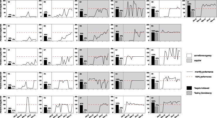
Fig. 4.
Graphical displays of water quality monitoring performance. Each graph depicts the monthly monitoring levels achieved by a MfSW collaborating institution between when they entered the MfSW program (July 2013 earliest) and December 2014. Months with no data were prior to the institution entering the MfSW program. Performance levels, shown as a solid black line, were calculated as the percentage of microbial testing targets met monthly. Testing targets and program start dates differed among institutions. We also indicate two aggregate performance metrics: Targets Achieved, the overall percent of targets met throughout the program duration (outcome 1, solid bar) and Testing Consistency, the percentage of months during which targets were met (outcome 2, striped bar). Surveillance agencies are indicated with a white background, and piped water suppliers are indicated with a gray background. The graphs are ordered vertically according to monitoring performance as measured by Targets Achieved (solid bar). The lowest performer is placed in the top left position, and the highest performer is in the top right position.

