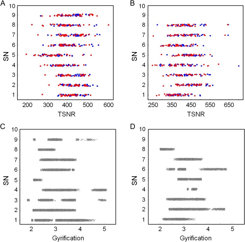
Figure 4.
Scatter plots of frequency (out of 10 runs total) of SN as a function of TSNR (panels (A) and (B)) and gyrification (panels (C) and (D)). Red and blue markers in panels (A) and (B) correspond to data from sessions 1 and 2, respectively. Panels (A) and (C) show data computed from parcellation A. Panels (B) and (D) show data computed from parcellation B. There is no significant correlation between TSNR or gyrification and the frequency of a node being designated as SN. Data points are jittered along the y-axis to improve legibility (SN values are integers).

